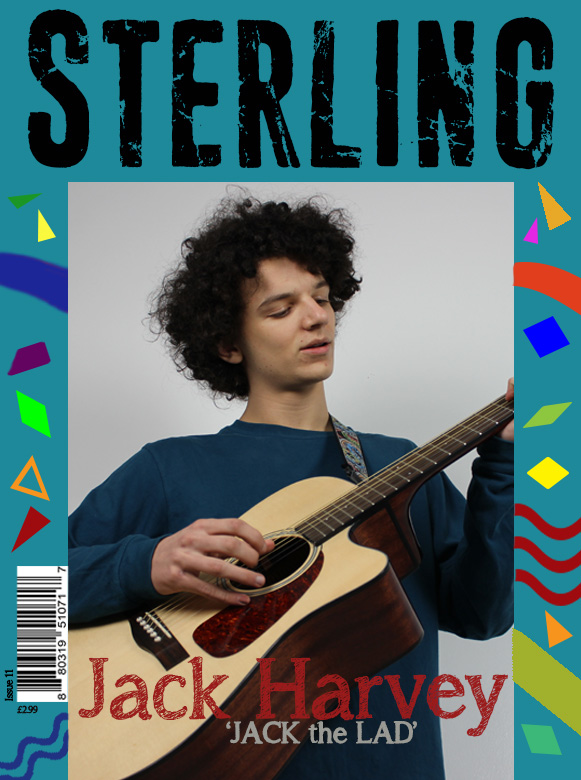
Cover- WWW- Masthead clear. Stands out. EBI- The border was reciprocated, not entirely sure the font underneath Louis is clear, maybe a hard filled text. That's me being picky though, as it's not that big of a deal.
Contents Page- WWW- Clear layout, pictures well placed. EBI- Red writing difficult to read on the black background, maybe a more contrasting colour should be used.
Double Page Spread- WWW- The title Is bold, clear and aesthetically pleasing, and the article is well placed. EBI- Louis's hair (on the left) was cut out more, use the blur tool to get rid of the sharp edges.
Cover- WWW- The masthead and the artists name are both very clear and easy to read. Nice playful background making it more appealing to different audiences. EBI- The bottom also had a boarder.
Contents page- WWW- Good use of images. The boarder matches the title. EBI- The colours didn't contrast too much.
DPS- WWW- The same font is used for the title like all the way though making it a very fluid design of the magazine. The images are edited well and the article looks nice wrapping around the picture of the artist. EBI- I dunno.
Cover: WWW- The masthead is bold and clear. The photo is also bold and well taken. EBI- I would stick to a plain background as the patterns may become too busy.
Contents: WWW- Good use of images, lined up against the text. EBI- If you're going to stick with the blue boarder I think the black background is too harsh against it.
Double page: WWW- The title is clear and very effective. Good use of photos and a clear colour scheme. EBI- same size text throughout the whole of the article.
WWW- I like the photos that you have used and i also like the use of props in your photos. I like the fonts that you have used. EBI- The writing on the contents page is not very visible due to dark colours. The writing may need to be a little brighter.
What went well? The masthead is large and appealing which is successful in drawing the reader. The use of the guitar as mise-en-scene is relevant as it's synonymous with music.
Even better if: I feel as if the background of the image doesn't collborate effctively with the background of the cover. You could try to find a blending process.
Contents
What went well? Good use of three images to portray a wide range of aspects in your magazine. The colour blend of black and yellow complement one and other.
Even better if: The dark text on the dark background make the text difficult to decipher. To improve you could use a lighter tone of text.
Double page spread:
What went well? You've split your pages up relatively equally, and shifted the majority your text onto the right hand side.
Even better if: You could perhaps succinct your text in order for it to appear less demanding or time consuming on first glance.
Cover- WWW- colourful and attractive cover. Good use of colour and styling. EBI- the cover included some headlines to attract the audience in and give them a feel for what the magazine includes
Content- WWW- pictures all line up and correspond to text EBI- not sure about the black background and colour choices
Double page spread- WWW- I like the style of the double page spread. The fonts work well together and picture look professional. EBI- N/A
Front cover WWW- Mise en scene inclusion looks good EBI- Move the image up slightly so it doesn't run off the page
Contents WWW- Pictures perfectly aligned so it looks neat and tidy EBI- The black background contrasts the blue to much and the black doesn't run as a theme through the magazine
DPS WWW- Layout looks very stylish and professional EBI- Can't think of much but maybe the text could be put into columns
Cover- WWW- Good photo used on the front cover and I like the use of props, I like the background shapes and I also like the effect used on the title EBI- Make the price clearer Contents- WWW-Good colour scheme used and a interesting layout EBI- Make the red font brighter so it stands out better Double Page- WWW- Interesting and good photos used and also the layout is good. EBI-
cover WWW The photo used helps to create a strong theme for the tone of the magazine EBI Maybe moving the image a bit higher would create a more solid cover
Contents WWW - Interesting colour scheme EBI - maybe more features would bulk the page up more
Dps - WWW - Interesting photo use and editing that illustrates the tone of the article EBI -
cover www: the bold image and mast head Ebi: move the bar code into a different place
contents page www: good range of images used Ebi: stretch the contents title out so it fits the whole of the page
double page www: good use of images and good amount of text too Ebi: follow the colour scheme through out the whole of it, even if you just added bit more blue on it would link them all together more.
Cover- WWW- I really like the colours that you have chosen for your front cover as they are very eye catchy and appealing. I really like the layout of your front cover as it is very organised and structured well. EBI- maybe include some cover lines but then again I'm not sure you need to add them. Contents- WWW- The pictures used are very good and I also like the fact that they are in line with the text. EBI- Add a page number to your contents page. Double page spread- WWW- I really like the style of your double page spread, the fonts that you have chosen work well together. The images used also look very professional. EBI- Include page numbers.


Cover-
ReplyDeleteWWW- good use of colours, helps the magazine stand out
EBI- if the barcode was placed at the bottom or top but not in the middle
Contents-
WWW- good use of images
EBI- would be better if there was no blue bored
Double page-
WWW- good editing skills on the images
EBI- try and keep the text the same throughout the page
Cover-
ReplyDeleteWWW- Masthead clear. Stands out.
EBI- The border was reciprocated, not entirely sure the font underneath Louis is clear, maybe a hard filled text. That's me being picky though, as it's not that big of a deal.
Contents Page-
WWW- Clear layout, pictures well placed.
EBI- Red writing difficult to read on the black background, maybe a more contrasting colour should be used.
Double Page Spread-
WWW- The title Is bold, clear and aesthetically pleasing, and the article is well placed.
EBI- Louis's hair (on the left) was cut out more, use the blur tool to get rid of the sharp edges.
Cover-
ReplyDeleteWWW- The masthead and the artists name are both very clear and easy to read. Nice playful background making it more appealing to different audiences.
EBI- The bottom also had a boarder.
Contents page-
WWW- Good use of images. The boarder matches the title.
EBI- The colours didn't contrast too much.
DPS-
WWW- The same font is used for the title like all the way though making it a very fluid design of the magazine. The images are edited well and the article looks nice wrapping around the picture of the artist.
EBI- I dunno.
Cover: WWW- The masthead is bold and clear. The photo is also bold and well taken.
ReplyDeleteEBI- I would stick to a plain background as the patterns may become too busy.
Contents:
WWW- Good use of images, lined up against the text.
EBI- If you're going to stick with the blue boarder I think the black background is too harsh against it.
Double page:
WWW- The title is clear and very effective. Good use of photos and a clear colour scheme.
EBI- same size text throughout the whole of the article.
WWW- I like the photos that you have used and i also like the use of props in your photos. I like the fonts that you have used.
ReplyDeleteEBI- The writing on the contents page is not very visible due to dark colours. The writing may need to be a little brighter.
Cover
ReplyDeleteWhat went well? The masthead is large and appealing which is successful in drawing the reader. The use of the guitar as mise-en-scene is relevant as it's synonymous with music.
Even better if: I feel as if the background of the image doesn't collborate effctively with the background of the cover. You could try to find a blending process.
Contents
What went well? Good use of three images to portray a wide range of aspects in your magazine. The colour blend of black and yellow complement one and other.
Even better if: The dark text on the dark background make the text difficult to decipher. To improve you could use a lighter tone of text.
Double page spread:
What went well? You've split your pages up relatively equally, and shifted the majority your text onto the right hand side.
Even better if: You could perhaps succinct your text in order for it to appear less demanding or time consuming on first glance.
Cover
ReplyDeleteWWW: I really like the use of colour and the props in the photo
EBI: move the picture up so it doesn't run off the page
Contents
WWW: the layout is really good and the colour scheme
EBI: more text would be better and making it slightly bigger
DPS
WWW: This is a really professional DPS and looks really good with the rest of your pieces
EBI:
Cover-
ReplyDeletewww- use of colours and props is really good
ebi- date and issue number
Contents-
www- kept with the theme and really good images again
ebi- maybe use the same background as the cover to stay with theme even more
DPS-
www- looks really professional and a great layout
ebi- cant think of anything
Cover
ReplyDeleteWWW - Prop inclusion
EBI - Price is enlarged
Contents
WWW - Pictures are aligned
EBI - More appropriate cover
DP Spread
WWW - Background differentiation is good !
EBI - Text was filtered into columns
Cover-
ReplyDeleteWWW- colourful and attractive cover. Good use of colour and styling.
EBI- the cover included some headlines to attract the audience in and give them a feel for what the magazine includes
Content-
WWW- pictures all line up and correspond to text
EBI- not sure about the black background and colour choices
Double page spread-
WWW- I like the style of the double page spread. The fonts work well together and picture look professional.
EBI- N/A
Front cover
ReplyDeleteWWW- Mise en scene inclusion looks good
EBI- Move the image up slightly so it doesn't run off the page
Contents
WWW- Pictures perfectly aligned so it looks neat and tidy
EBI- The black background contrasts the blue to much and the black doesn't run as a theme through the magazine
DPS
WWW- Layout looks very stylish and professional
EBI- Can't think of much but maybe the text could be put into columns
Cover-
ReplyDeleteWWW- Good photo used on the front cover and I like the use of props, I like the background shapes and I also like the effect used on the title
EBI- Make the price clearer
Contents-
WWW-Good colour scheme used and a interesting layout
EBI- Make the red font brighter so it stands out better
Double Page-
WWW- Interesting and good photos used and also the layout is good.
EBI-
cover
ReplyDeleteWWW The photo used helps to create a strong theme for the tone of the magazine
EBI Maybe moving the image a bit higher would create a more solid cover
Contents
WWW - Interesting colour scheme
EBI - maybe more features would bulk the page up more
Dps -
WWW - Interesting photo use and editing that illustrates the tone of the article
EBI -
cover
ReplyDeletewww: the bold image and mast head
Ebi: move the bar code into a different place
contents page
www: good range of images used
Ebi: stretch the contents title out so it fits the whole of the page
double page
www: good use of images and good amount of text too
Ebi: follow the colour scheme through out the whole of it, even if you just added bit more blue on it would link them all together more.
Cover-
ReplyDeleteWWW-Interesting choice of background, works well with bold masthead
EBI-Maybe move the image up so there is more of a border around the image
Contents-
WWW-Good choice of images, well aligned
EBI-Used brighter text colour, the red looks a bit dull in comparison to the cover
DPS-
WWW-Good choice of font and images used
EBI-Included page numbers and maybe wrote the article in a column format?
Cover-
ReplyDeleteWWW- I really like the colours that you have chosen for your front cover as they are very eye catchy and appealing. I really like the layout of your front cover as it is very organised and structured well.
EBI- maybe include some cover lines but then again I'm not sure you need to add them.
Contents-
WWW- The pictures used are very good and I also like the fact that they are in line with the text.
EBI- Add a page number to your contents page.
Double page spread-
WWW- I really like the style of your double page spread, the fonts that you have chosen work well together. The images used also look very professional.
EBI- Include page numbers.